
Speechless Blog 6: Preparing the premiere


Working toward our opening night in less than a week. Directing and composing - realising what a large project it is!
....and this is as far as this post went in late February! I am writing this retrospectively now, but useful all the same, perhaps.
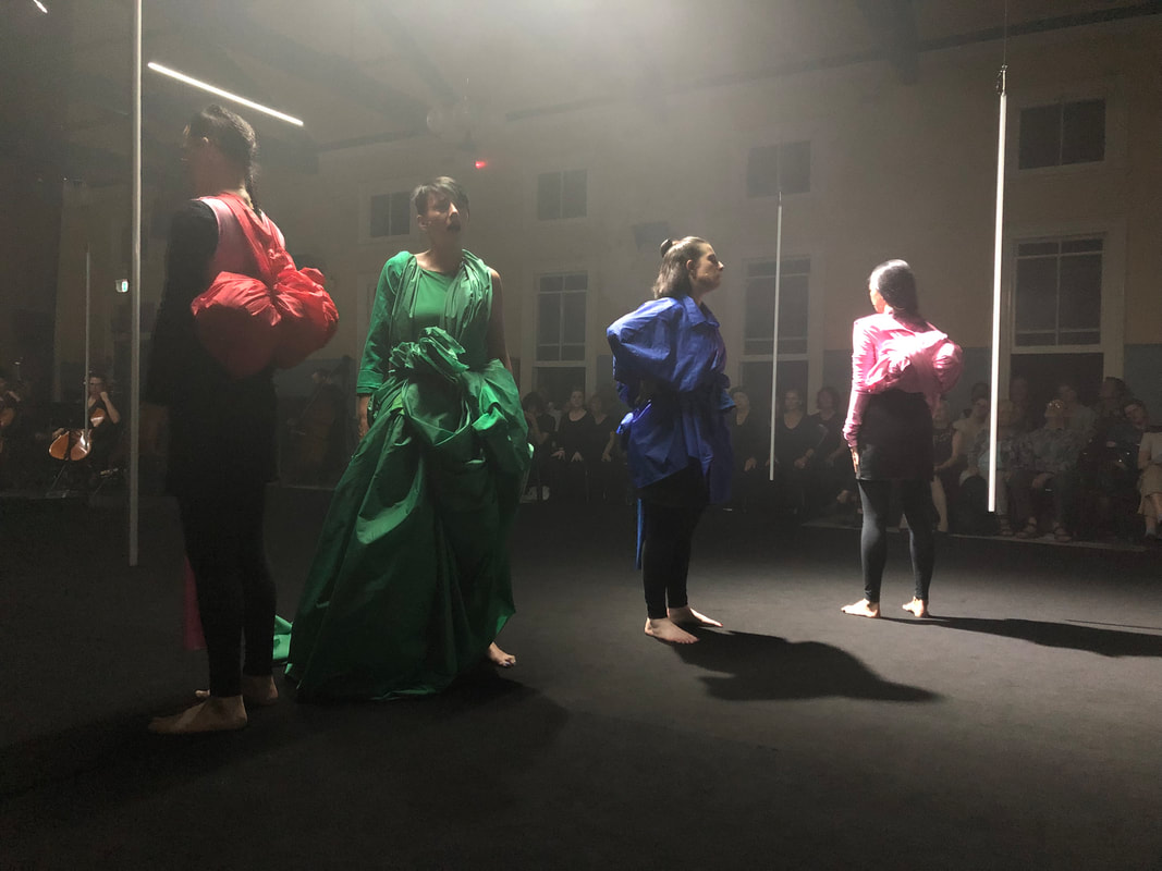
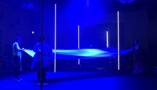
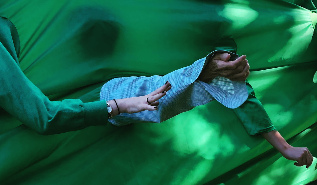
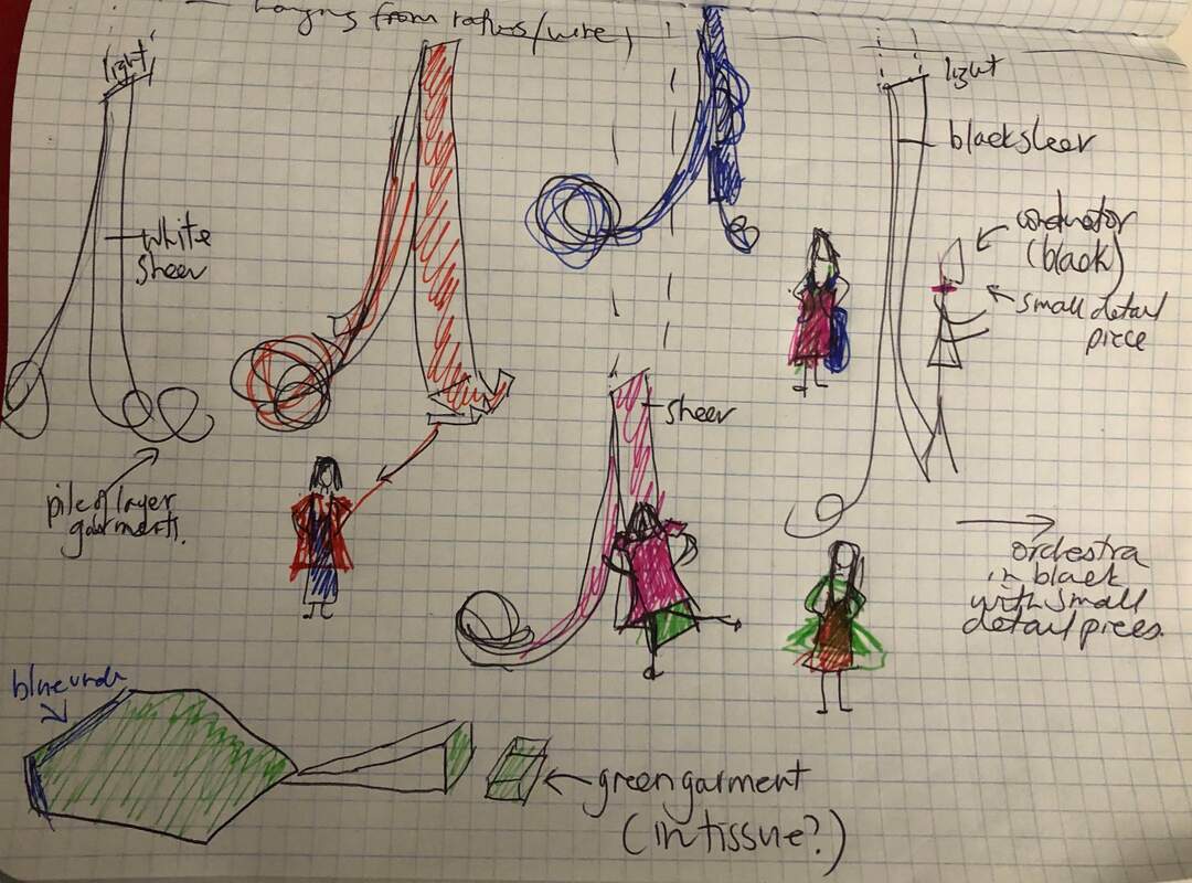
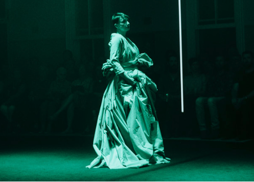
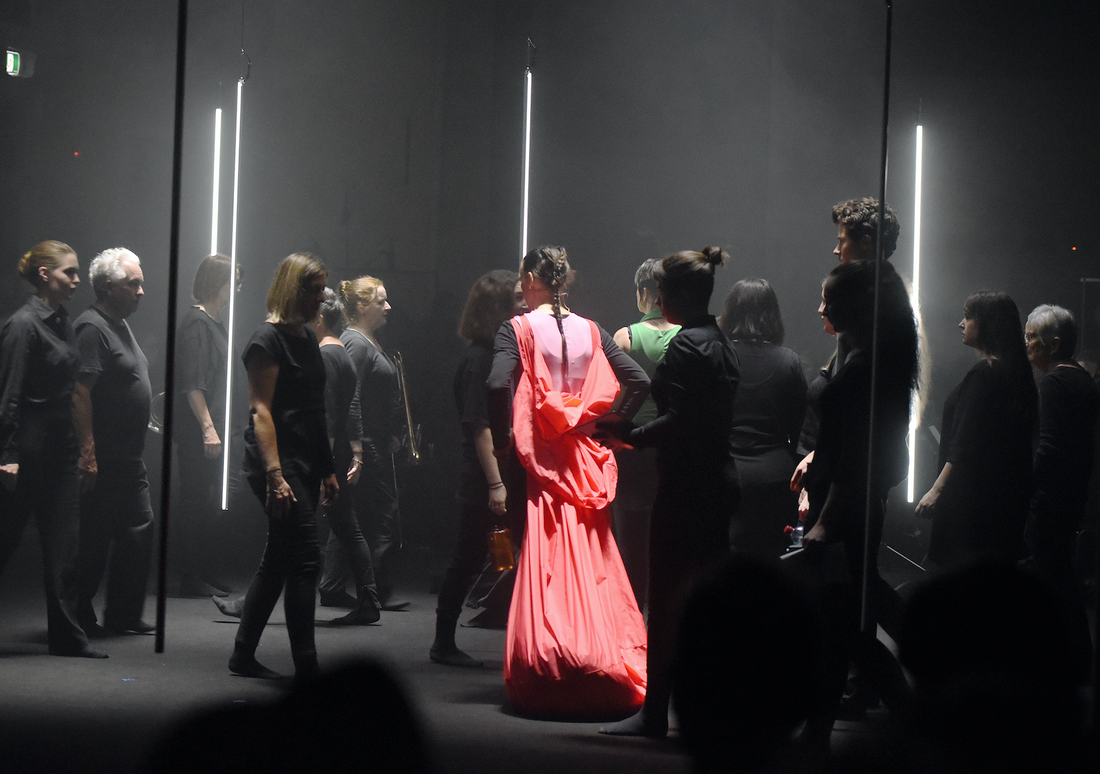
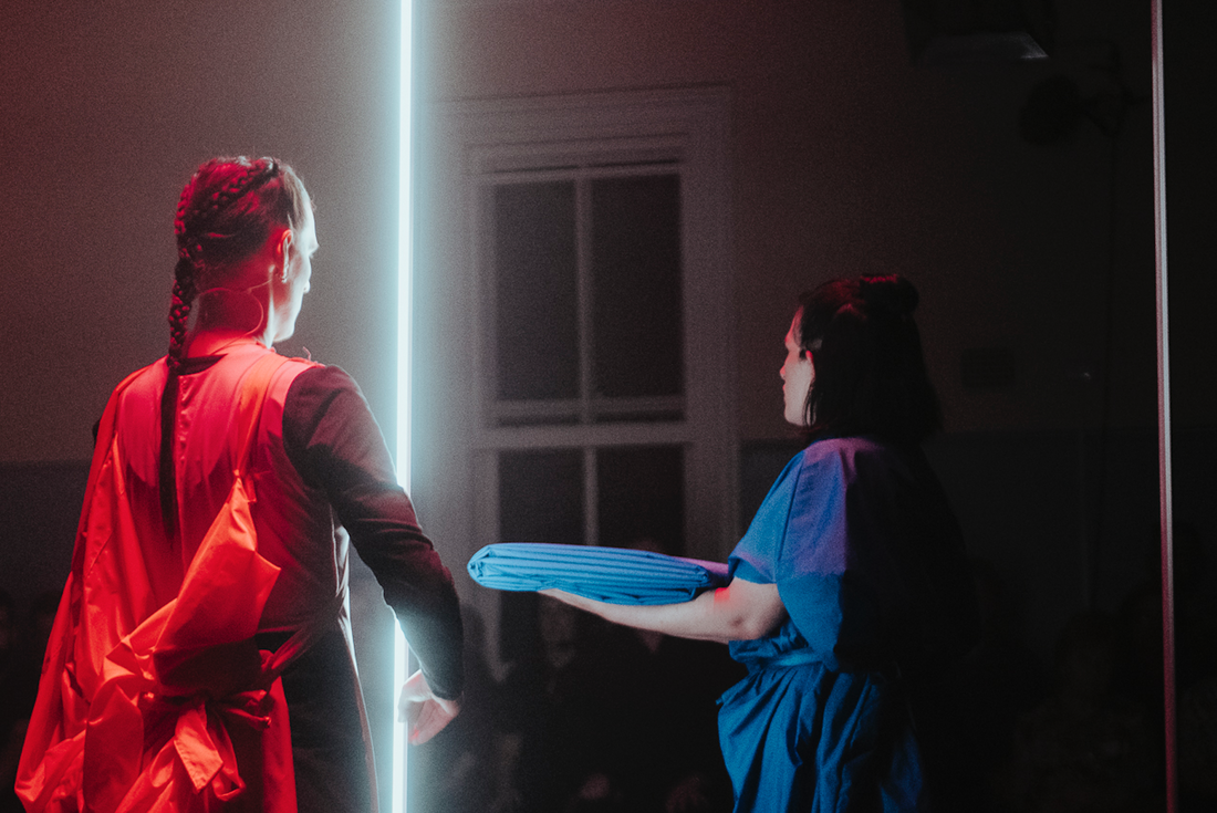
After deciding on a colour scheme, in conjunction with the lighting designer Matt Adey, we set about designing the set - large flags of colour that hang from horizontal bars of light. The space would be hung with vertical LED lights too, referencing the bars found in many of the children's drawings from the report. The flags would also be the costumes, transforming as the work progressed, as the life of refugees transform when they start a new life in a different country. You adapt, but you can't completely erase the culture of your upbringing. The principal tasks for the performers, for which I always wanted a 'performance art' over 'theatre' approach, would be centred around their own flag (single colour) - a very long piece of fabric, but also on the role they take when interacting with flags of others. The colours of the flags were taken from the children's drawings in the report that are used for the orchestral parts, in attempt to link the set to the score and thus, the music. The black and white hangs acted as reference colours, hung in the space as a kind of bureaucratic frame, and a nod to some of our design influences. The aim was always that the flags would end up as a integral part of the soloists being - transforming into backpacks to travel with through life, and in the case of the one and only opera singer in the work, transform into an elaborate opera gown - beautifully designed in the development process by my assistant director Rakini Devi.
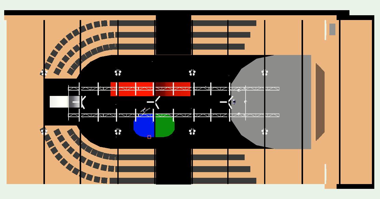
The flag is a symbolic link to nationhood. All the design elements are stripped away from the flag in Speechless, rather it becomes singular, without symbolism or historic reference- a flat colour that contrasts with the others, but clearly defines that person (or vocal soloist, in this case). Its length, over 15 meters, is unwieldy and requires careful handling. It connects the floor to the roof or sky. What each soloist does with their flag, and the flags of others, defines the soloist 'characters' to some extent. The block, colours of the flags contrasts against the black carpeted stage - the carpet found in government offices. A black void the audience sit uncomfortably close to - they need to cross it to get to their seats. The audience sit in chairs typical of waiting rooms in government offices, around the black carpet defined 'stage' area - in a U shape, with the orchestra at one end. The choir are among them.
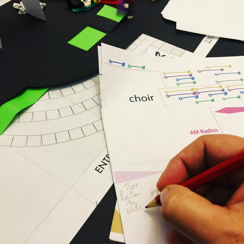
I prepared for the blocking by reading film scripts, film theory, watching Roberto Castellucci operas and Robert Wilson books and I was very interested in his concept of silent opera. I particularly enjoyed the books of 'scenarios' by Werner Herzog, and set about writing my own scenarios for Speechless. I stayed quite faithful to these, in retrospect. I revisited my love of the art of Mona Hartoum and Yoko Ono, amongst others, which I shared with Matt and Alex as a discussion point for the set and costume design. You can see some of the inspirational images I prepared as talking points here. I created a scale model of the stage area and hanging flags, so i could work out how things would fit proportionally.
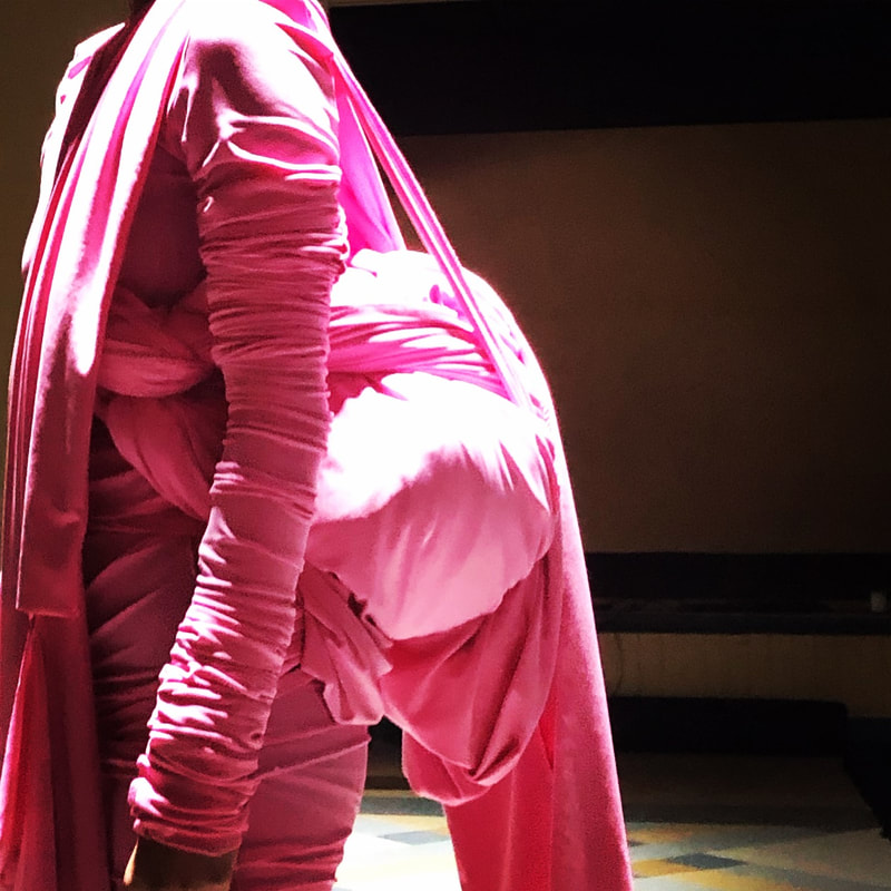
I plotted the action against the score, letting the music drive the decision making process every step of the way. Three of the four fabrics, chosen by our costume designer Alex McQuire, are tent fabrics, and made their own sounds when handled, which were often similar to the sounds the vocalists made themselves. The pink fabric, however, was a sensuous jersey type length, stretchy and pliable, and made into a very constrictive costume. These details helped us formulate a series of approaches for each colour: formal (blue), surreal (red) uncontrolled (pink) and operatic (green). The relationship with fabric is something I have explored before, in the last show I directed: The Velvet Palace (PICA, 1998). It too highlighted red and black as fundamental colours in the design (the colours of the anarchy flag). Rakini Devi also uses fabric in her performance art practice - in fact, she was featured as a dancer in The Velvet Palace.
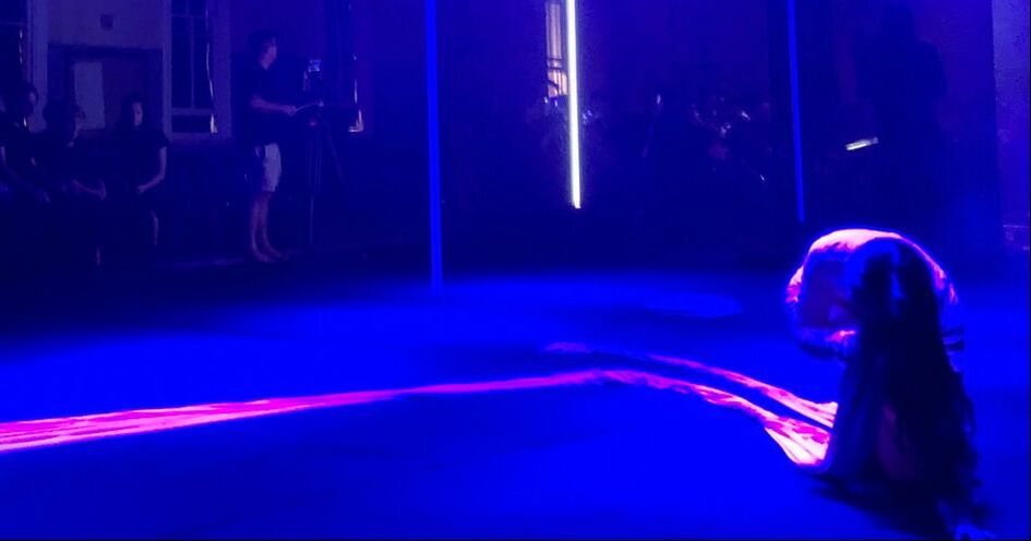
These foundational ideas developed in the short time immediately leading to the premiere. The blue, red and pink fabrics were pulled from their hang during the performance, with very different approaches to each one. The red was packed into an extended, almost surrealist backpack at the very start, which the soloist must trail around for the majority of the show. The blue length was formally folded using flag folding techniques, and later attached as a kind of Japanese Obi, again of Rakini's design, as an extension of the existing costume make from the same fabric. The pink flag was dramatically whipped away at the beginning of a solo, after being attached in a quick and practical manner, only to be blandly dropped at the conclusion of the solo, and later gathered up for comfort. The green flag had the arms of used clothes sewn into it, referencing the children overboard affair. After attempts to engage the choir with this piece in different ways, we decided to focus on turning this into a gown in Act III, pulling it from a store beneath the conductors podium. This was one of the most difficult pieces to establish in the blocking for me - because it had so much potential. We had an elaborate plan to store it under the floor, its colour revealed in the shape of the Australian Border Force logo cut into the carpet flooring. This created too many problems in the space, and eventually, the concept was removed, but it remained concealed until its assemblage, unlike the other flags which hung proudly in the space, sometimes constricting clear vision, just like real flags tend to do.
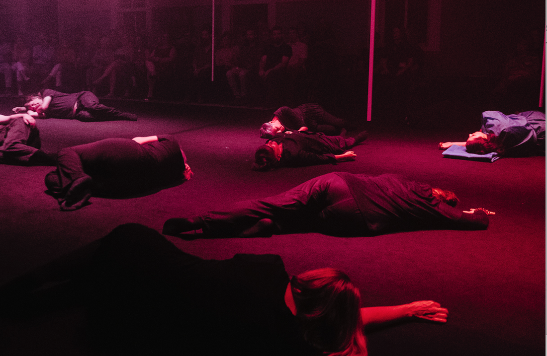
And so, we constructed the work in and for the space, gradually pulling all these ideas together, with the trajectory of the music as the main 'design'. We plotted the light, allowing a range of approaches from slow unfolding washes that transition across the space, to moments where the light responds to the music and soloists voices. The choir moved at certain points, en masse, referencing Trumps 'caravan'. At one point, they lie on the government carpet floor for some time in the dark, when the room sings with feedback. They lie with nothing for comfort, alongside the soloists who at least have backpack, folded or deserted flag they can fashion into a pillow. Except for the opera singer, whose arrangement is yet to come.
The response to the set design ranged widely in reviews and public discussions. Its deliberate abstract nature confused some, but open pathways for reading to others. I wanted to avoid, at all costs, a didactic experience. None of this information about the staging, other than a short reference to flags and nationhood, appeared in the program, as follows:
The colour scheme of the set and costumes is drawn from drawings in the report, and the directorial approach references migration, government facilities and formalities, adapted possessions, historical turning points and the seeking of objects for comfort, contrasted with an installation based approach to scenography. - Speechless Program
This was a piece about response, I was not speaking for any group, or trying to represent anyone. So it was important the production design - light, costumes, set - did the same.
You can download the full program here.
"Visually, Speechless was inescapably captivating. The audience were placed in curved rows around the oval performance space, giving the uncomfortable impression of spectatorship, as if watching a football game. Thick strips of fabric dangling from the ceiling, reminiscent of bar-graphs detailing horrific statistics, were pulled down and tightly wrapped around the principal performers, the set itself becoming an oppressive actor on stage. Matthew Adey’s lighting design included pole-like lights suspended from the ceiling to just above the floor, acting as both structural guideposts for the actions of the performers and as physical accompaniments to the Australian Bass Orchestra. In one particularly striking display in the third act, the red lights overhead drifted glacially from the back of the space near the orchestra, to the front of the room, menacing in its hue and bathing all in its light." - Laura Biemmi, Seesaw.
"abstract colour-coded lighting, set and costume design which was apparently related to the content but in a way that remained largely cerebral." - Humphrey Bower, Daily Review
[photos not attributed are mine]